<hero description="FRELLED is astronomical data viewer designed for 3D FITS files. This page serves as a user manual." imagename="" cropposition="" />
FRELLED : A User's Guide

FRELLED is astronomical data viewer designed for 3D FITS files. It's primarily aimed at visualising data cubes in realtime, interactive 3D, and is particularly geared toward HI and simulation data. This page serves as a user manual.
Overview
FRELLED is a set of Python scripts for Blender, an open-source 3D graphics creation suite. The scripts allow users to import 3-dimensional FITS files into Blender, where they can be viewed from any angle in realtime. Users can freely move the viewpoint to any position or rotation and the resulting image is instantly updated – there is no need to wait for any recalculation. The scripts are designed to work with observational HI data cubes and generic simulation data, but in principle there is no reason why any other 3D FITS files cannot be used.
Blender is first and foremost software for artists. It is designed for architectural, character, landscape and general-purpose modelling and rendering, and also game creation. It is not intended for scientific visualisation and has no inbuilt astronomical functions. However, being designed to allow users to visualise large amounts of 3-dimensional data means it has many features that standard mathematical visualisation tools lack. Fortunately, it also has a Python interpreter.
FRELLED’s main features are :
- 2D / 3D mode
- Allow the user to interactively generate mask regions within the data
- Masks can be freely toggled on and off
- Masks can be assigned names, which can be used to re-find them later
- Overlay SDSS RGB images
- Generate integrated flux maps on-the-fly
- Interactively generate contour plots and renzograms
- Generate output parameters for MIRIAD tasks : mbspect (can be run interactively), moment, mask
- Assign colours based on velocity as well as intensity
- Support for world coordinate systems
- Display vectors and n-body particles
The main motivational development behind FRELLED was that looking at 3D data in 3D is infinitely more awesome than looking at slices. However, it soon became obvious that the ability to interactively mask data made source extraction – literally – about 50x faster. Being able to quickly re-navigate to any particular source by inputting its name is a very simple feature, but one that also makes life a lot more bearable for anyone working with hundreds of potential detections within a data cube.
3D viewing may be more awesome, but 2D viewers can allow the user to find fainter sources more easily – noise emission along the line of sight can cause problems for a 3D viewer. FRELLED can also be set to operate as a conventional 2D viewer. Like kvis, it allows the user to switch between the various projections, while maintaining its other capabilities.
The FRELLED scripts allow Blender to access FITS files and are designed to make life as straightforward as possible for astronomers using them – but they do not change the underlying code of Blender in any way. Wherever possible I attempt to distinguish between what Blender is doing, and what new capability has been added by FRELLED.
Installation
Currently FRELLED requires Blender 2.49 to run. This can be downloaded [http://download.blender.org/release/Blender2.49b/ here]. Blender 2.49 requires a Python installation. The scripts have been tested with Python 2.6.2, but in principle can operate with any Python 2 release, provided the following Python modules are installed :
In order to guarantee that Blender will correctly interface with Python (Blender has its own internal Python as well) it is recommended that you have a version of Python 2.6 installed, somewhere.
You also need a decent graphics card. To test if your machine has the necessary capabilities, download this [http://www.rhysy.net/Resources/FRELLED/FRELL3DTest.blend test file], and open it with Blender (this file does not require any Python modules). If you see some kind of galaxy then you should not have any problems.
There is no installation process as such for FRELLED itself, you just need to download the files. However a very little initial organisation is needed to work with them properly.
Setup
First, save a master copy of the main files (FRELLED.blend and the accompanying Python scripts) wherever is convenient. The extra file “.b.blend” file should go in Blender’s .blender subdirectory (Windows) or the user’s home directory (Linux). Note that files with a name beginning with a ‘.’ are hidden on Linux.
Secondly, create a directory containing the FITS file you want to work with and a copy of the main FRELLED files. This directory will contain all the supplementary files that the software will create and work with. Potentially, this can include hundreds of image files running into gigabytes of disc space (though usually very much less).
FRELLED will automatically locate the FITS file contained within the directory within which it was placed. If you have multiple FITS files it will pick one at random, so it is best to work with one directory containing one FITS file. However if you wish, FRELLED allows the user to manually input the directory and/or filename. Although typing in the whole directory is a right pain, so don’t do that.
To start FRELLED : Navigate to the directory where you want to use FRELLED and enter the command, “blender FRELLED.blend”. Don’t open it from a GUI because error messages are printed to the terminal (on Windows a command prompt opens automatically).
A word of warning : Blender has an internal version of Python that operates independently of any other Python version installed. Calling some Python modules from within Blender (such as numpy) can sometimes fail spectacularly on Linux. FRELLED attempts to avoid this by running most of the FITS processing via external scripts. Provided you can run a Python script via the command, “python whatever.py”, all should be well (Blender must also be able to find and access the “os” module).
Basic Operation
While other software may take several minutes to render a single view of a 3D file to an image, with FRELLED the process is instantaneous. This allows users to explore data sets in a completely new way.
Blender has no native capability to handle FITS files. Although it can work with relatively large data sets (on a good system, millions of data points can be handled in realtime) the size of many astronomical data prohibits the use of Blender's native internal data formats. The way to circumvent this issue is to import the FITS file as a sequence of images, for which Blender is far more optimised. In this way, data sets ~6003 voxels can be accommodated.
FRELLED relies on the user having a capable graphics card. The downside to GPU rendering is that they usually have much less memory than ordinary RAM. This means that larger data sets must be broken into smaller subsets for use with FRELLED in 3D mode, though this is less important in 2D mode.
The software is distributed as the file FRELLED.blend which can be opened in Blender. The interface is configured to optimise Blender as a FITS viewer - none of its functionality has been disabled, just hidden. The ‘.b.blend’ file provides other colour schemes which are more suitable for a FITS viewer than Blender’s default.
In 3D mode, FRELLED displays FITS cubes volumetrically. In 2D mode it displays them as sequences of images, as with any conventional viewer such as kvis or ds9. Both modes have the same basic operational procedure :
1) The FITS cube is converted to a sequence of images. The data range and colour scale (linear or logarithmic) are controlled by the user. This must be repeated every time the user wants to change the data range or colour scale.
2) The images are imported into Blender. The images are retained in the directory in which they were created, they are not stored within Blender (though this is possible, see section XXX).
3) Apart from simply viewing the data, FRELLED also serves as a GUI for several miriad tasks. The user can create objects within Blender which can serve to define parameters for tasks such as immask, mbspect, fits and moment. Additional features include the ability to perform a NED search and open the SDSS Navigate tool, without the need to type in coordinates. Generating moment maps, renzograms, and overlaying contour plots on optical images is also possible.
The following pages describe the usage of FRELLED as well as explaining how the programs work. As the operation of these is somewhat different to conventional viewing programs, users are strongly encouraged to actually read the manual[1] at least once. Those who dive straight in will likely end up completely frelled.
Quick Start Guide

Rebellious users who decided to completely ignore what I just said should invoke the help of a magical moose. It’s the big button in the middle. You can’t miss it. The magical moose will automatically find a sensible data range to display, turn everything on that needs to be on, convert the FITS file to .png images, load those images, draw the axes, make the tea and do your laundry.
It won’t do as good a job as if the user carefully alters the settings themselves – moose are clumsy, because of the hooves - but it will be good enough for a first look. It’s also a useful way to find settings that can then be tweaked to give better results.
The moose is a slow, methodical animal and will load the entire cube. The faster alternative is to employ a princess, who will only load the shortest axis of the cube. This is much better if you want to see what your data looks like but you’re worried the world is about to end.
LESS QUICK START GUIDE : The Story Of Princess Olivia And The Magical Moose Whose Name No-One Could Quite Remember
Once upon a time, the fair Princess Olivia was bored and decided to look in her magic mirror. “Mirror, mirror, on the wall,” said the Princess, “who has the best HI data of them all ?”
“You, O Princess”, said the mirror, “but it would be even better if you looked at it with FRELLED.”
The Princess decided that this was a good idea and would go to the library to learn all about it. It was a long way to walk, but luckily a magical moose appeared from nowhere. That’s what magical mooses do.
“Climb aboard !” said the moose, “I’ll take you to the library in no time at all.” The moose ran to the library at an amazing speed. “Thanks, moose !” said the Princess, “ I don’t suppose you know where I could find out about FRELLED ?”
“Why yes,” said the moose, “for I am a magical moose.” The moose and the Princess sat down in front of one of the library’s many computers.
“First,” said the moose, “you should decide whether you want the data to be in 3D or 2D, and push the little blue button accordingly.”
The Princess sighed a disdainful sigh. “You can’t be a very magical moose,” she said. “Why would I want to look at data in 2D ? I am a Princess, you know !”
“Ah, quite,” said the moose, who magically blushed and shuffled his feet in an embarrassed manner. “How silly of me. Anyway, next you should press the ‘99’ button”.[2]
“Why ?” asked Princess Olivia.
“This will work out how much of the data should be transparent,” said the moose, “and then automatically set the appropriate data value in the ‘maximum data value’ box. ‘99’ means that 99% of the data will be transparent, which usually looks quite nice.”
“How very convenient,” declared Princess Olivia in a regal manner. “Anything else ?”
“Yes,” said the moose, “You must choose which projections to export. Let’s try just the XY projection for now, it will be faster. Then you need to press the ‘Map 1’ button in the top part of the panel.”
The Princess did as she was bid, and gasped.
“Gasp !” said Princess Olivia, “I see that something else happened when I pressed map 1 !”
“Yes,” said the magical moose, “The top part controls how the data is converted, but it also sets defaults for how to display the data. That’s what the buttons at the bottom are for.”
The Princess was delighted that her regal fingers would be saved from the excessive manual labour of pressing more buttons than were absolutely necessary. “I suppose you are quite a magical moose, after all,” she said, grudgingly. “What’s next, moose ?”
“All you have to do now is press ‘Go !” said the magical moose.
“Alright,” said the Princess, “but will this take long ? I have to go and fight off an invading horde of goblins this afternoon.”[3]
“Not at all !” said the moose, proudly, “The code is parallelised. It shouldn’t take more than a couple of minutes.” And indeed, in almost no time at all, the Princess marvelled to see a wonderful three-dimensional image appear on the screen. “Wow !” she exclaimed, “This is better than Avatar ! Especially since it doesn’t have any 9ft tall smurfs. But what about all these other buttons ?”
“There isn’t any time to explain. This is only a quick start guide,” said the moose, magically breaking the fourth wall. But he tipped his head and something white and fluttery fell from his antlers. “Try reading this manual. That should answer all your questions.”
Princess Olivia thought about this and adjusted her tiara in a haughty fashion. She wasn’t sure that Princesses were allowed to read manuals. Perhaps she could find a servant to read it for her. “Oh, alright,” she said. “Goodbye moose !”
The moose magically disappeared. Later on, Princess Olivia decided that fighting the goblins was too much effort. Instead she decided to teach them all about FRELLED. And they all analysed HI data ever after.
THE END.
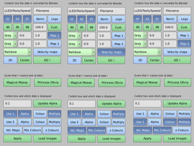
Interface

FRELLED main interface.
Opening FRELLED.blend should reveal something like the image on the right. The screen is divided into three main areas : 1) The 3D viewport, where the data will be displayed; 2) The Menu screen, where the user can control how they display and interact with the data; 3) The Timeline, used for special interactions with the data.
The “Window selector” allows the user to switch between several different preset interfaces. Control panel allows the user to select different display colour schemes via the “Themes” tab, and also alter the clipping of the displayed cubes via the “Clip alpha” slider in the “System & OpenGL” section. It is also recommended to first set the “Time Out” setting to zero to prevent Blender from dumping the imported images from video memory (unfortunately this setting cannot be saved, so this must be done every time the file is opened).

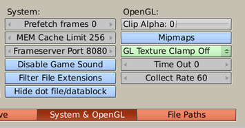
"System and Open GL" section of the Control Panel screen.
The default MainViewer window is optimised for running the scripts and viewing the data. 4Views has four preset viewports instead of just one, one for each projection plus one more at an oblique angle. Developer provides access to the FRELLED source code, with a slightly larger area for the menu code.
The menus section is where the various settings to convert and import the FITS file can be accessed. There are five available menus : Display, Analyse, Movies, Vectors and Particles. Green buttons at the bottom of each menu allow you to access the other (the “script selector” is only useful if you need to edit the source code). Should something go wrong (which is, obviously, impossible), the GUI menus will revert to the underlying Python code. To reactivate the GUI, press “Text” (next to the script selector) and then “Run Python Script”. Alternatively hover the mouse over the Python code and press Alt+P. Note that you cannot (and should not) access the any other scripts until a cube has been loaded (even if that means just drawing its axes).
The “shader selector” determines how the images are rendered once they are imported. The default setting of “textured” shows them as actual images. “Solid” shows them as monochrome planes, “wireframe” shows the outline of the planes, “box” displays wire-cubes of the dimensions of the images, Note that pressing the Z key (with the mouse in the 3D viewport) will switch between solid and wireframe mode. Textured mode can be re-enabled using the GUI button, or by pressing ALT+Z.
Blender can place objects on any of 20 different layers. Objects can be on multiple layers simultaneously and multiple layers can be displayed. Normally FRELLED will automatically select the appropriate layer(s) to display (see appendix II if something goes awry).
The “timeline” area is only useful in 2D mode and for creating animations. In 2D mode, the short green line indicates which channel or slice of the cube is currently displayed, while “Start” and “End” indicate the slice or channel range of the cube in the currently-visible projection. Next to them is a box where (shift+LMB) the precise channel or slice can be entered. When creating animations, the green line and the frame values allow control over which frame of the animation is currently shown. See section XXXX for more details.
A few other interface points to keep in mind :
- Any operation in Blender requires the mouse pointer to be in the appropriate window. For example, pressing ALT+P to run a Python script will have no effect if the pointer is in the 3D viewport.
- Selected objects are highlighted with an outline. ‘Active’ objects (not relevant for FRELLED) have a lighter outline. Objects are selected by right-clicking on or near them. The last selected object will be the active object. Press “A” to select or unselect all objects on the currently-visible layer(s).
- Shift+RMB on or near an object will unselect it if it is already selected. If it is not, it will be added to the selected objects.
- Any Blender window can be maximized with CRTL+↑. This can be useful to get the best possible view of the data, or if you want to edit the Python scripts.
- Progress status and error messages are displayed in Blender’s console window in Windows, or in the terminal from which Blender was run in Linux (if you open Blender via a GUI in Linux, you won’t get any progress or error messages, so don’t do that).
- The currently operating task is shown in the top banner which normally reads, “Blender 2.49” with a green background. If Blender freezes completely, it is probably loading images into video memory. If this takes more than a few minutes, give up.
A complete user’s guide to Blender can be found here.
A list of keyboard shortcuts is available here.
Converting the Data

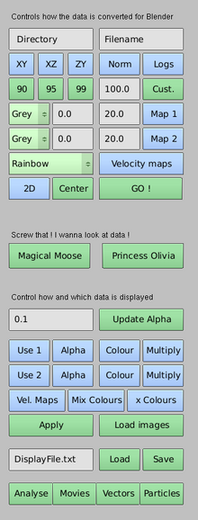
FRELLED Display interface.
To import the FITS file into FRELLED, use the default Display script. This is divided into two sections – the upper section controls how to convert the data, while the lower section controls how the data is displayed. Only limited control of the display is possible once the data is converted, so it’s important to choose good settings for this (otherwise it must be converted again, which can take several minutes).
FRELLED should automatically have located the FITS file within the directory containing FRELLED.blend – if so “Filename” will be replaced with the actual filename. If it did not, check you opened the correct copy of the .blend and that both it and the FITS file reside within the same directory. Make sure the file has the extension “.fits” and not “.fit” or “.FITS” or any other variant.
If you just press “Go !” at this stage, the axes of the cube will be drawn and nothing else will happen.
Although it’s preferable to work with only a single FITS file in a directory, it is possible to cope with multiple FITS in the same directory. If the wrong file has been found, you can simply type in the correct name (omitting the .fits extension). But, if there are no FITS files present, everything else will fail horribly and the world will explode.
You can also type in the full path name to the directory, although why you’d want to do that is a mystery.
The “XY / XZ / YZ” toggle buttons choose which projections of the cube to convert into .png images. Ideally all three should be selected, but it is often possible to work with just one or two, which can save time and memory. The projections have the same naming convention as kvis :
XY : RA – Declination
XZ : RA – Velocity
ZY : Declination – Velocity
“Norm” tells FRELLED to produce a normalised cube (see below), while enabling “Logs” will use a logarithmic intensity scale when producing the images. This requires the data values chosen to be positive and greater than zero.

Left : a poor choice of data range for 3D display - much of the image is noisy and will obscure the interesting data. Right : a good of data range, clipping most of the noise.
The “90 / 95 / 99 / 100.0 / Cust.” buttons find the data values at 90, 95% etc. of the maximum value in the cube (100.0 is the default percentage used by “Cust.”). Pressing these buttons will find the value and set them in the data range boxes below (defaults 0.0 to 20.0). These are extremely important, especially in 3D mode. Data above the maximum value will be given uniform colour and transparency. For example, if you hit the 90% button, 10% of the data will appear to be solid white, and block the view of the rest of the data. 99% is generally a much better level to use. The lower data value (all points below which will appear completely transparent) is generally less important, unless all the values are offset from zero. Choosing sensible values to use can be a matter of guesswork and trial and error.
Useful trick : first load the cube using the "Princess Olivia" button. This will automatically select a 99% cut and only load the shortest axis of the cube, thus minimizing the loading time. Then you can adjust the other settings and possibly get a better result, before loading the other projections.

Main display section, which controls how the FITS file is converted to PNG images for import into FRELLED.
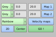
Display section
This section of the script controls precisely how to convert the cube into .png images. FRELLED allows the user to export two maps based on the intensity range of the data. The drop-down menus (defaults are both “Grey”) choose which colour schemes to use for each map. Next to them are the data range values to use (defaults 0.0 and 20.0), which can be independent for each map. The “Map 1” and “Map 2” toggles tell FRELLED which maps to export. Exporting just one map is easier, saves time, and is usually perfectly adequate. Using two maps can give better results and can be extremely useful for very complex data sets (see section XXXX).
Pressing the toggles for any of the maps automatically sets defaults in the lower part of the screen for how the data is displayed - see section XXXX.
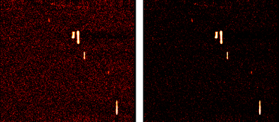
The third drop-down menu and the corresponding toggle tell FRELLED to produce velocity maps. These vary the colour according to the velocity (or z-axis). For very extended sources filling much of the cube (e.g. galactic HI), these can help show the 3D structure of the data more clearly – e.g. GALFA-HI data, shown below.

Galactic HI data (credit : GALFA-HI) with and without velocity-based colour maps.
The “2D” toggle tells FRELLED to use 2D mode. If not selected it will assume 3D mode. Note that this also affects the defaults in the lower part of the script – if you alter these, be aware that pressing “2D” again will restore their defaults.
"Center" is useful for navigation (see section XXXX) - it will place the 3D cursor at the center of the data cube.
“Go !” will do several things. The script will write the FITS header and the export settings to a text file, convert the cube into images (only if any projections are selected), draw the axes of the cube[4], and – importantly – create several placeholder objects in Blender to tell it whether 3D or 2D mode should be used. These objects are essential to using FRELLED – the “Analyse” and other menus cannot be accessed until “Go !” has been pressed. More obviously, it will also import the images into FRELLED.
If your data is a funny shape you’ll get a pop-up asking if you want to stretch it to a cube (this only affects the display, not the data itself).
Normalising data

Above : using a standard data cube. Below : the same data cube normalised to the peak value in each channel.
If you selected “Norm”, then pressing “Go !” will also generate a whole new FITS file, with the data normalised to the maximum value in each channel. The minimum and maximum values must be between zero and one. For example, say you enter 0.25 and 0.99. In this case, in each channel, 25% of the data will be completely transparent and 1% will be completely opaque (ignoring NaNs). This means the contrast in each channel will be the same, regardless of the dynamic range.
This is a complete waste of time for cubes full of point sources, but can give dramatically better results for (say) galactic HI. Here the signal fills the entire sky, but in some channels the data is all very bright and in others very faint. Normalising the cube makes it possible to see both faint and bright structures, and is particularly useful if using a logarithmic scale gives poor results. This disadvantage is that the absolute intensity values are lost – this is good for enhancing structures, but not for comparing brightness.
If you reload a normalised cube (it will have been given the _norm extension) later, you should use values from 0.0 to 1.0 to re-create the display you had when creating it. In the above example, 25% of the values in each channel will be below 0.0 and 1% will be above 1.0. Unlike when creating the cube, when reloading it the min/max values are not constrained to be between 0.0 and 1.0
Displaying the Data
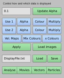
Section of the Display menu controlling how the data is shown within FRELLED.
The lower section of the Display script is what controls precisely how the data is displayed. Unlike the settings in the upper section, values here can be altered without the need to re-export the images.
By default, pressing “Map 1” in the upper part will enable “Use 1”, “Alpha” and “Multiply” in this lower section. If nothing else is set, this will display the data as the sum of the intensity values along each line of sight. If you also enable “Colour” here, the display will give somewhat higher contrast, but is potentially more difficult to interpret.
Some colour schemes are suitable for use with a single map to control both colour and transparency (alpha), while others are only useful to control the colour (these are marked “2D” in the drop-down menus). This is because Blender generates transparency based on RGB colour, where black is totally transparent and white is totally opaque. So, only colour schemes which go from black to white can be used to control transparency and colour at the same time.
If you want the display to look prettier, the solution is to use two maps. By default, pressing “Map 2” in the upper part will enable “Use 2”, “Colour” and “Multiply” in the lower section. This means you can have map 1 controlling transparency, with another (nicer) colour scheme controlling the colour (see below for examples).
All of the colour schemes are linear, except for “High Contrast” which is a black-white colour scheme with R,G,B values v = f^5, where f = (flux - fluxmin)/ (fluxmax – fluxmin). This is useful when there are many more low flux values than high ones.
Both Map 1, Map 2 and velocity maps can be generated and displayed at different times. For example, you may first have exported a single intensity map, but then find that a velocity map would also be useful. In this case, you would then disable “Map 1” (not strictly necessary but this saves time - it prevents FRELLED from re-creating a map which already exists), but keep “Use 1” enabled (so that it will still be displayed). Velocity maps should then be enabled in both the upper and lower panels. Some examples are shown below.
“Apply” will attempt to update the settings for how the maps are displayed, provided they have already been generated and loaded. Another option is to use the “Load images” button, which re-imports the data into Blender. This also happens automatically if a map has not been previously displayed. “Load images” is useful if you know the .png images already exist and don’t need to re-export them; “Apply” is useful (and faster) if you just want to change how the images are displayed.

Examples of different ways of importing and displaying data. Left : Create and display a single intensity map for the data cube. Center : Create a velocity map for the data cube. Display the data using a combination of an existing intensity map and the velocity map. Right : Create another intensity map for the data cube. Display the data using a combination of this second map and existing velocity maps.

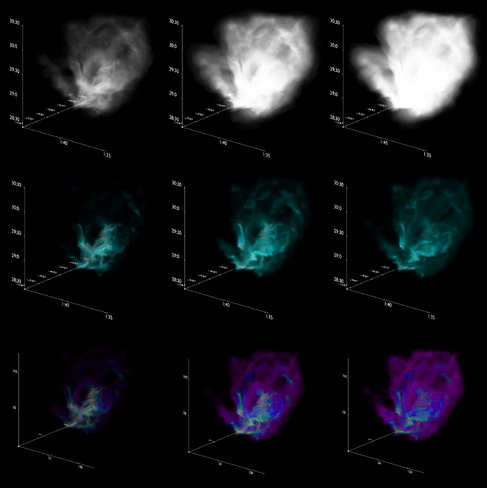
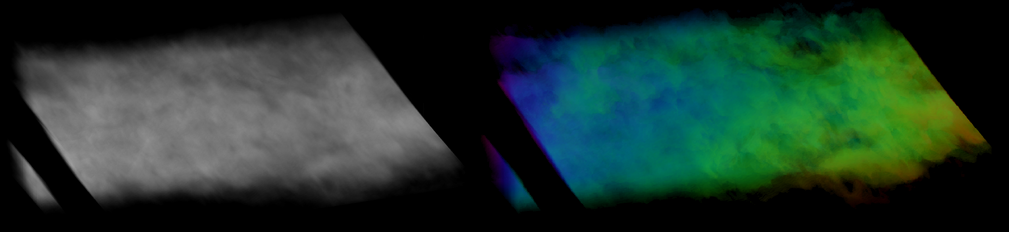
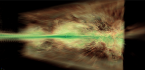
Top : Using a single greyscale map to affect only transparency. Middle : Using a single map (“cold” colour scheme) to affect both colour and transparency. Bottom : Using two maps to – a greyscale to control the transparency, and a “spectrum” colour scheme for the colours. From left to right, alpha=0.1, 0.5, 1.0. The data set is a simulation of a star-forming cloud.
“Update alpha” will set the transparency value. Zero will make everything transparent, 1.0 will make the data completely opaque at maximum intensity.
If no options are set in the lower panel, maps will be created but not displayed, which is normally pointless (though the axes will be displayed). FRELLED will run into difficulties if you try to display a map (lower panel) which has not already been created (upper panel).
Some other options are accessible via the Control Panel “System & OpenGL” tab, as shown in section XXXX. “Clip Alpha” sets a threshold – any part of the images with an alpha value lower than that threshold are not shown. Higher alpha values are not affected. If you’re interested in bright emission, this is a very simple, instant and reliable way to remove fainter emission.
“Mipmaps”are a way to prevent the appearance of pixilation. This can give extremely pretty - but possibly misleading – results as it will appear as though the data has been sampled at an infinite number of points. They also require significant extra memory (~30 %) so are not enabled by default.
It’s even possible to trick FRELLED and get it to load a different FITS file for each map. Sounds crazy ? Normally yes, but for a simulation you may want to have the transparency controlled by the density and the colour showing (say) the temperature. First, produce Map 1,as normal. Then disable “Map 1”, and, externally, remove or rename the FITS file. Add the second file you want to display into the working directory, but give it the same name the first file had initially. Then produce and display Map 2 as normal, keeping “Use 1” enabled (this method is fine for rotation movies but not time series – see section XXXX).
Once the data cube has loaded, you can start to look around. The viewpoint controls are as follows :
Pan : Shift+MMB
Rotate : MMB
Zoom : Wheel
Place cursor : LMB
Center view on cursor : C
You can also pan left and right with the mouse wheel if you hold down CTRL, and up and down by holding SHIFT. Note that this refers, for example, to up and down in Blender’s viewport – depending on how you have rotated the view, this does not necessarily correspond to north and south.
The 3D cursor serves as a marker. If it’s in the way, simply move it somewhere else by left clicking. Centring the view on the cursor also changes the pivot point (around which the view rotates) to its location. If you get lost, you can re-center the cursor to the center of the cube with the “Center” button.
Navigation is also possible with the numeric keypad :
Zoom : + / -
View XY projection : 1
View XZ projection : 7
View ZY projection : 3
Toggle perspective : 5
Rotate up : 8
Rotate down : 2
Rotate left : 4
Rotate right : 6
Rotation via the keypad is done in constant increments of 5 degrees. This can be changed in the Control Panel view in the section “View & Controls”. You can look along the opposite direction of any projection with CRTL+N, where N is 1,3 or 7.
Some limited navigation is also possible from the Analyse menu.
Analysing Data


Defining regions
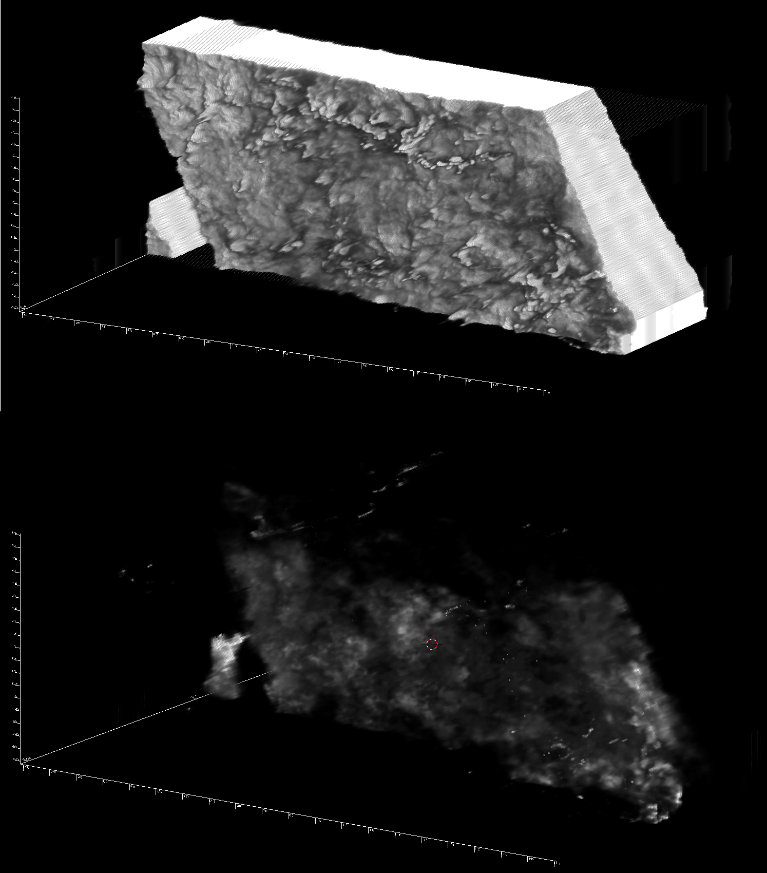
FRELLED supports some basic data analysis tasks directly and can enable more complex tasks in external programs more easily. The key feature is that the user can interactively generate "region masks" around chosen parts of their data, to mask and catalogue data, produce contour maps, query the SDSS and NED, and (via other programs) do just about anything else that requires defining a volume. Of course, this is also possible in other programs - the advantage here is that this can be done interactively through a visual interface. This is far more rapid than defining coordinates numerically. When precision is required, it's also possible to enter numerical values.
To generate a region, find something interesting in the data and place the cursor in the center. Ideally, use all 3 projections to accurately determine the where the center is (see section XXXX). Toggle between orthographic and perspective view mode, if necessary, with 5 on the numeric keypad. Choose the name you want to give the source in the “Name” box. The counter should ordinarily be left at zero.
Once you have placed the cursor where you want it, press “Add” to create a region. This will appear as a black cube, which FRELLED will assign the name you have chosen. You can change the size of this region with the “S” key in the 3D view and either use the mouse to set the scale, or type in a scaling factor with the keyboard. To limit the scaling to a particular axis, press X, Y or Z as required. When you are happy with the scaling, press the LMB or the return key to accept it, or RMB to cancel and start over. You can also adjust the position of the region with the G (for “grab”) key.

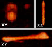
Example of a source seen in all three major projections.
As a more readable list of useful keystrokes, I strongly recommend learning the following :
G : Grab a region and move it around.
S : Scale a region.
R : Rotate a region. Avoid this - most analysis tasks ignore it ! See below for details.
X / Y / Z : While the above transforms are active, constrain them to the specified axis. Conventionally, X is RA, Z is Dec and Y is velocity.
CTRL : While the above transformations are active, constrain changes to be in integers (e.g. move a region exactly 1 pixel at a time in the mouse direction).
SHIFT : While the transforms are active, makes them much less sensitive to mouse movement. Useful for more precise adjustments.
LMB : Accept the current active transformation.
RMB : Cancel the current active transformation and return the active region object to its last accepted state.
Naming and finding regions
The name of the region created is displayed in the lower-left corner of the viewport (e.g. “Name_001”). The numeric suffix will be automatically updated as you add more regions. To select a previously generated region, type its number into the counter box (and change the name if necessary) and press “Select”. The region will then be highlighted with a blue outline. If the counter is set at zero, all objects with the entered prefix will be selected. You can then center the view on that region by pressing “.” on the numeric keypad (which will also automatically adjust the zoom), or via SHIFT+S, choose “Cursor->Selection” and then pressing C to center the view on the cursor as normal.
If you add more regions while the counter is not zero, the names of the new regions will be automatically adjusted if there is a conflict with existing objects. If, say the count is 5, but object “Name_005” already exists, the object will be given the next available name. If however, object 5 does not exist, then the program will assume the user intended to start from 5 and continue naming sources working upwards from 5 (this is useful if you already have another source catalogue and want a consistent naming scheme).
Blender does not allow objects to have names longer than 21 characters. To allow the numerical suffix, the names of regions are limited by FRELLED to be 13 characters long. This theoretically allows the user to generate up to 10 million regions, which is overkill for the foreseeable future. Names cannot follow the widely-used "JHHMMSS+DDMMSS" format, and a jolly good thing that is too. Such names are unpronounceable and lead to many papers being unreadable.
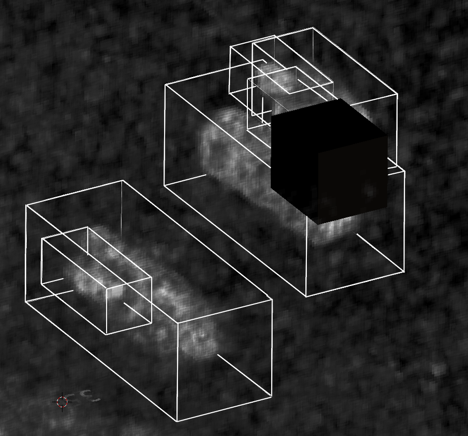
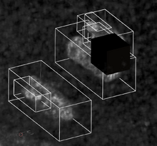
Regions in FRELLED in wireframe and solid modes.
Selecting regions interactively and controlling visibility
Sometimes it's more useful to have a region displayed as a wireframe, sometimes as an opaque mask. Both display modes can be toggled using the "Wire" and "Solid" buttons (these will act on all selected regions). It is not currently possible to hide a region completely. "Solid" mode displays the regions as opaque black, changing the colour is not currently possible.
Sometimes you may want to select a region without knowing its name. In this case the region can be selected by right-clicking near it (or SHIFT+RMB if you want currently selected regions to remain selected). However, because the FITS file itself is displayed using Blender's internal objects, this can often result in selecting part of the FITS file instead. To avoid this, use the blue "FITS" toggle button to temporarily disable the view of the FITS file.
Creating source catalogues
Once you’re happy with / bored / sick of creating the source catalogue you can export it for use with whatever programs you need to do actual science with. “Export” will save the selected regions in a text file with a format that can be read by MIRIAD, as well as a second file for importing them into FRELLED with the “Import” button.
Regions are saved in two formats : 1) “BlenderMask.txt” containing the regions in pixel coordinates, which can be read in by FRELLED; 2) “WCSMask.txt” containing the regions in WCS format. Both are saved unless your data doesn’t have a WCS, in which case only “BlenderMask.txt” will be created. If you have both, pressing “Import” will open a pop-up allowing you to choose which file you want to import from. Be aware :
- "BlenderMask.txt” contains everything about the imported regions, including spatial width, but in pixel coordinates. Importing this file into a data set from another part of the sky won’t give you meaningful results.
- "WCSMask.txt” contains the data in WCS, but doesn’t (currently) save the spatial size of the regions.
- Neither file saves the region shape – cuboids are assumed. If you need to save weird-shaped or rotated regions, you need to save the Blender file (see section XXXX).
If you want to import external catalogues using the WCS file, the format is (whitespace separated) :
RA (degrees) Dec (degrees) Velocity(km/s) Velocity width (km/s)
The "BlenderMask" file has the following format (whitespace separated) :
Name X Z Y XW ZW YW
Where X, Y, Z are pixel positions and XW, ZW, YW are pixel widths.
Analysing the data with MIRIAD
The “mbspect” button acts as a GUI for the MIRIAD task mbspect, which is useful for quantifying the parameters of HI detections. I’m going to assume the user is already familiar with msbpect, if not, you probably don't need it (or you’ll have to Google it). Some parameters here are still hard-coded to assume the user is looking at HI data.
With only one region selected, “mbspect” will first check that the command “miriad” will actually start MIRIAD. If it doesn’t, that’s your problem. If it does, it will check if a MIRIAD file exists (looking for the .mir extension). If it doesn’t, it will then run the MIRIAD fits task to convert the FITS file you’re working with into MIRIAD’s own format (the original file is preserved). Note that if you already have a MIRIAD file – even if it’s the wrong one – FRELLED will use that rather than converting it. Be very careful when there are multiple FITS files in the same directory !
Once that’s done, it will use the selected (target) region as the profile in mbspect, displaying the extracted spectrum in an XSERVE window. Masks will be generated using the selected object plus any other regions which overlap the target on the sky. The source is assumed to be a point and the “width” parameter set to be the lowest odd number larger than the beam in pixels. It will attempt to do position fitting, but if this fails, it will automatically re-run with position fitting disabled. A comment will be printed on the spectrum to let you know that position fitting failed. Note that sometimes MIRIAD thinks position fitting succeeded, when in fact the fitted position can be miles off, so always compare the input and fitted positions. This is good advice when using mbspect in any case.
This interactive mode is intended to provide a useful first-look at the data. For a more detailed analysis where other parameters may need to be altered, the script also writes the input parameters to a series of text files, named according to the selected regions (placed in the mbspect subdirectory), e.g. :
Overlaying SDSS optical data
Contour plots and renzograms
Moment maps
Querying NED and the SDSS
Measuring the total flux
Axes
2D Mode
The Fourth Dimension (or how to impress people in presentations)
Displaying Vectors
Particles
Appendix (I) : Importing Data from Other Sources
Appendix (II) : Working With Layers
Appendix (III) : Other Issues
Troubleshooting
Notes for Developers
Features That Are Already On My "ToDo" List, So Don't Bother Asking For Them
WCSMask should include names
Export should also produce QuickCat
Feedback
Latest activity
Photos and videos are a great way to add visuals to your wiki. Find videos about your topic by exploring Wikia's Video Library.
All-sky data from the Leiden-Argentine-Bonn HI survey.
- ↑ Seriously. Even if reading manuals is against your religion.
- ↑ The moose had the magical ability to pronounce quotation marks.
- ↑ Princess Olivia was a warrior princess.
- ↑ Note that the velocity axis currently assumes the file is an HI data cube. The axes are robust to cubes spanning the entire sky or as small as a few minutes of time or arc, or a few km/s velocity. Data sets smaller than this, or without a WCS, will be given axes labelled by the dimensions of the cube in pixels.